If zombies are real, that is.
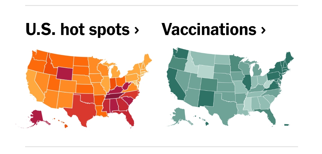
Wary readers should note that these maps are from today’s New York Times, so there’s that to consider. Dark on the orange to purple map means high infection rates, the darkest are Covid hotspots. Darker on the green vaccination map means higher vaccination rates.
Please note that when I mock the former Confederacy it is their radical right wing leaders I am mocking, the ones who continue to represent, according to their time-honored ways, our Death Sentence Loving Bible belts. The average person in the former Confederacy is about is fucked as the Confederate citizen who opposed slavery during the war, but was obliged to serve in the army of the Confederacy or die by hanging or firing squad.
The correlation between the map of high Covid-19 infection rates, low vaccine rates and the former Confederacy, turf of the strongest Trump support, of course, could be purely a product of the Lyin’ New York Times, and you can confirm that with Q, or Mike Flynn, Sidney Powell, Ron Deathsantis, Kristi Noem, Steve Bannon, Mo Brooks, Lauren Boebert, Ron Johnson of Wisconsin or Roger Stone, for that matter. The NY Times, according to millions, lies more than Lyin’ Ted Cruz, or even the irrepressible Orange Polyp himself!
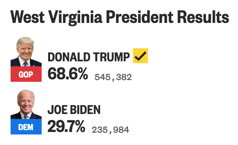
Check out the color of “moderate” right winger Joe Manchin’s West Virginia on the respective maps. Pale in terms of vaccine density, and going for Mr. Trump in the 70% range [1] in the stolen, fake, Chinese Communist-rigged election of 2020, they are a nice dark tone on the Covid infection map. Wait, that infection color is supposed to be… ah, never mind. THE PEOPLE REST!

[1] Damn near a million votes!